box-shadow property:
box-shadow css property enables you to cast a drop shadow from the frame of almost any element.
If a border-radius is specified on the element with a box shadow, the box shadow takes on the same rounded corners.
The box-shadow property adds shadow effects around an element's frame.
You can set multiple effects separated by commas.
Hence, box-shadow property attaches one or more drop-shadows to the box.
A box shadow is described by X and Y offsets relative to the element, blur and spread radius, and color.
Syntax:
box-shadow: h-shadow v-shadow blur spread color inset;
Value Description
h-shadow position of the horizontal shadow. Negative values are allowed (required)
v-shadow position of the vertical shadow. Negative values are allowed (required)
blur blur distance, ie: distance in pixels of blur (optional)
spread size of shadow (optional)
color color of the shadow (optional)
inset changes the shadow from an outer shadow (outset) to an inner shadow (optional)
Other syntax:
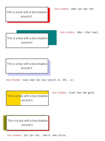
/* keyword values */
box-shadow: none;
/* offset-x | offset-y | color */
box-shadow: 80px -16px teal;
/* offset-x | offset-y | blur-radius | color */
box-shadow: 20px 5px 5px black;
/* offset-x | offset-y | blur-radius | spread-radius | color */
box-shadow: 2px 2px 2px 1px rgba(0, 0, 0, 0.2);
/* inset | offset-x | offset-y | color */
box-shadow: inset 5em 1em gold;
/* any number of shadows, separated by commas */
box-shadow: 3px 3px red, -1em 0 0.4em lightyellow;
/* global keywords */
box-shadow: inherit;
box-shadow: initial;
box-shadow: revert;
box-shadow: unset;
Eg:
<!DOCTYPE html>
<html>
<head>
<style>
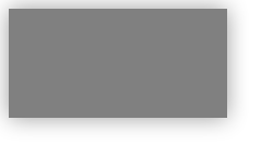
div {
width:200px;
height:100px;
background-color:grey;
box-shadow: 0px 0px 20px rgba(0, 0, 0, 0.4);
}
</style>
</head>
<body>
<div></div>
</body>
</html>
Outputs:
Eg2:
<!DOCTYPE html>
<html>
<head>
<style>
    div {
    width:300px;
    height:100px;
    background-color:grey;
    box-shadow: 10px 10px 5px red;
    }
</style>
</head>
<body>

<div></div>

</body>
</html>
Outputs:

For more information, see here.
Eg3:
For more information, see here.
box-shadow (border inside the element):
You can use css box-shadow to insert an inside border:
Consider following problem: when you hover over a div element, css border style expands div:
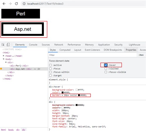
To fix: you can use the box-shadow property in this way, to display an internal border, and not expand the div element:
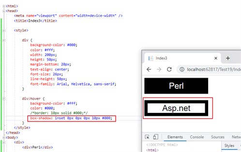
<!DOCTYPE html>

<html>
<head>
    <meta name="viewport" content="width=device-width" />
    <title>Index3</title>

    <style>

        div {
            background-color: #000;
            color: #fff;
            width: 200px;
            height: 50px;
            margin-bottom: 20px;
            text-align: center;
            font-size: 26px;
            line-height: 50px;
            font-family: Arial, Helvetica, sans-serif;
        }

        div:hover {
            background-color: #fff;
            color: #000;
            /*border: 10px solid #000;*/
            box-shadow: inset 0px 0px 0px 10px #000;
        }
    </style>
</head>
<body>
    <div>
        <div>Perl</div>

        <div>Asp.net</div>
    </div>
</body>
</html>
Outputs:
For more information, see here.